TIQUE: A MAGAZINE
FRONT COVER
TIQUE: A MAGAZINE FOR THE MODERN ANTIQUER
Problem: How do I design a masthead and magazine that uses a grid structure, typographic rules, and hierarchical levels? How can I design a system that would carry on throughout many editions? *All photos must be originals
Solution: TIQUE encompasses the world of antiquing through featured articles and sub-articles. The magazine takes a look at the unpredictable journey of antiquing – the stories, the places, and the memories. The magazine balances out the nostalgia with the modern context and future of antiquing. Whether antiquing is relevant to you through travel, design, history, or plain curiosity, the journal caters to the seekers, curators, and creators. The masthead, typographic system, and image treatment were all designed to be repeated among each edition of the magazine.
Focus: Typography, Print & Layout, Editorial, Photography
BACK COVER
ART DIRECTION
Art Direction: I chose the subject matter for this magazine as well as the content. I liked the juxtaposition of a modern and clean design with the subject of antiquing that is considered old and irrelevant to many. I was up for the challenge. I paired typography that was modern and sleek with thick serifs to visually show the juxtaposition. I developed a simple but bold color scheme that unified the imagery in the magazine. The photography in the magazine was taken by me and I edited them to give the spreads a mood. I also designed the title of the magazine and masthead. I chose a narrow san-serif with a quirky Q – clean and sleek with a treasure! I also wanted to evoke that phrase throughout the inside of the magazine.
WANT TO SEE MORE? Check out my type exploration
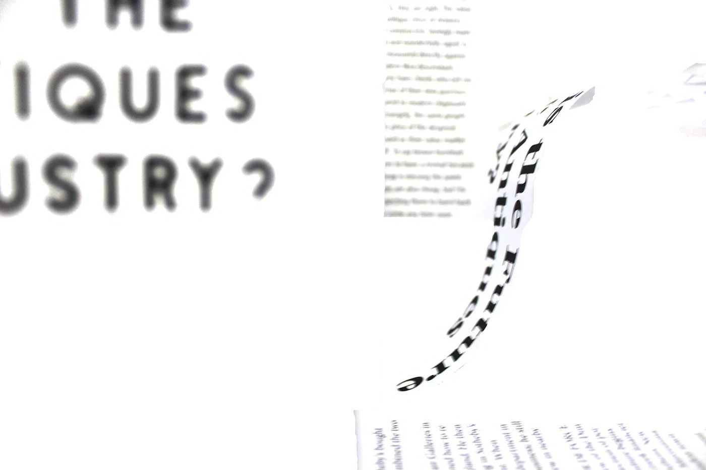
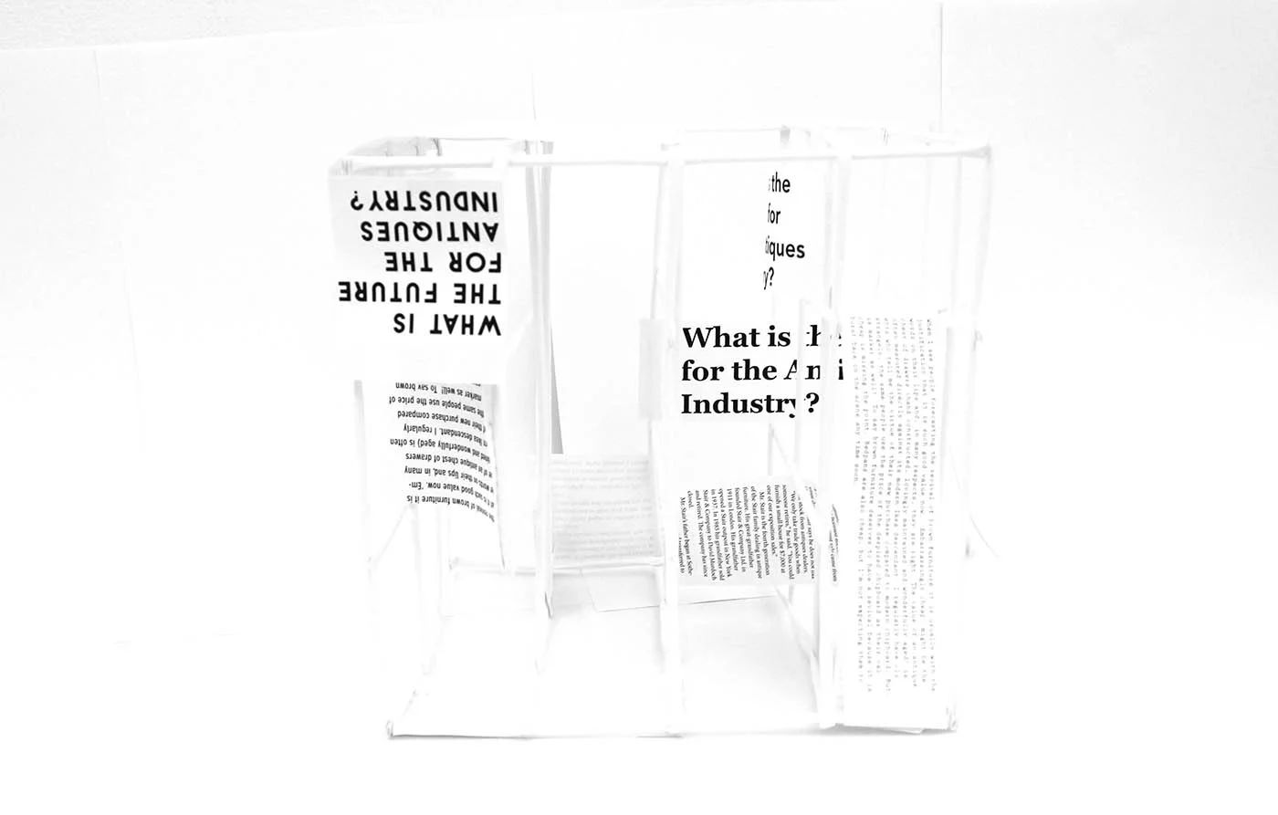
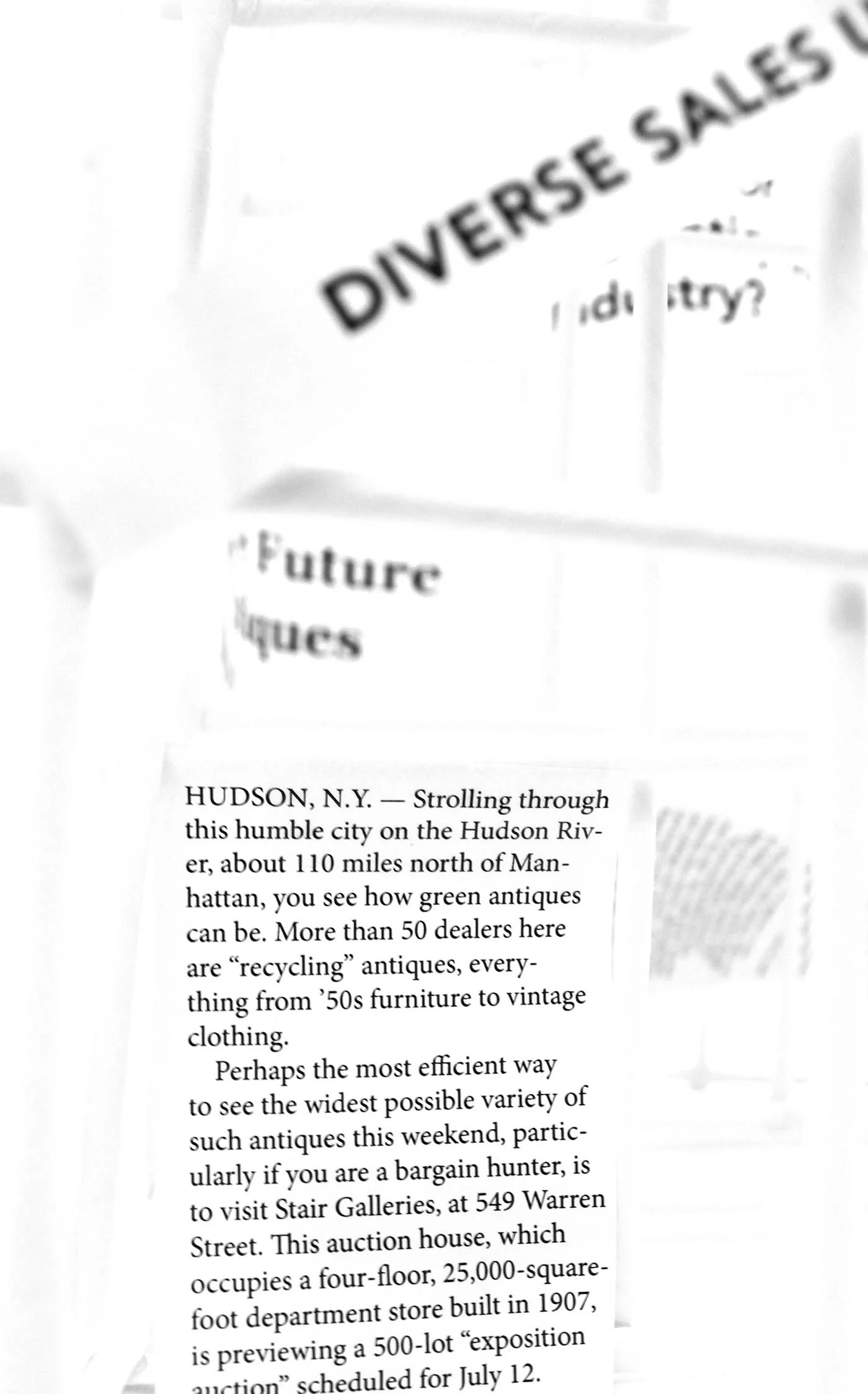
These 3D and digital type explorations served as my inspiration for grid structures and type hierarchy.


